
An ROC curve in a biometric system plots true-accept rate (TAR) against false-accept rate (FAR) as the matching threshold moves across every possible value. The operational lesson matters more than the definition: evaluate a fingerprint, face, or voice matcher at the specific operating point you plan to deploy, with confidence intervals attached, rather than trusting a single area-under-the-curve number. Demographic subgroups need their own curves, because a system that looks strong on average can fail unevenly across age, sex, or skin tone.
TL;DR:
- Evaluation must focus on the specific operating point used in deployment, not just the overall ROC or AUC metrics, to accurately predict real-world performance.
- ROC curves should be broken down and reported by demographic groups because performance can significantly vary across age, sex, or race, affecting fairness and risk.
- Full AUC summaries are misleading for deployment decisions; partial AUC in low-FAR regions and operating-point metrics with confidence intervals are more meaningful.
- Bootstrap methods and trial counts are essential for assessing statistical uncertainty, especially at very low false accept rates common in high-security applications.
- Vendors should provide detailed, stratified reporting, including trial sizes and confidence intervals, to ensure biometric system reliability and fairness in real-world scenarios.
Table of Contents
- What a ROC Curve Actually Shows in Biometric Verification
- AUC, Partial AUC, EER, and the Metrics That Actually Predict Deployment Behavior
- Computing ROC Curves and Measuring Statistical Uncertainty
- Deployment Reporting: Operating Points, DET Curves, and ISO/IEC 19795-1
- Demographic Fairness: Covariate-Specific ROC Estimation
- Where ROC Reporting Goes Wrong
- A Step-by-Step Evaluation Checklist
- Where Fraud Signals News Fits in This Conversation
- Primary Sources Worth Reading Directly
- The Editorial Take: Stop Reporting AUC Like It’s the Answer
- Sources
- FAQ
What a ROC Curve Actually Shows in Biometric Verification
Every biometric matcher outputs a similarity score for each comparison, whether it’s a fingerprint minutiae match, a face embedding distance, or a voiceprint correlation. Genuine comparisons (same person) tend to cluster at higher scores. Impostor comparisons (different people) cluster lower. The two distributions overlap somewhere in the middle, and that overlap is where every classification error originates.
A biometric ROC curve is built by sweeping a decision threshold across that score range and, at each value, recording two numbers: the true accept rate (the fraction of genuine pairs correctly matched, also called TAR) and the false accept rate (the fraction of impostor pairs incorrectly matched, or FAR). Plot FAR on the x-axis and TAR on the y-axis, connect the dots, and you get the curve. Lower the threshold and you accept more genuine users, but you also let in more impostors. Raise it and impostor rejections improve, but legitimate users start getting locked out. This trade-off is the entire story of ROC curve interpretation in biometrics, and no amount of statistical polish changes the underlying physics of overlapping score distributions.
The practical mapping to real systems looks different depending on modality:
- Face verification at a banking app’s onboarding step typically runs near FAR = 0.1% to 0.01%, because a false accept there means account takeover.
- Fingerprint unlock on a phone tolerates a higher FAR (often near 0.002% to 0.1%) because the attack surface is smaller and there’s a PIN fallback.
- Voice authentication in call centers often operates at a looser threshold, accepting more false accepts in exchange for lower false rejects, since a human agent still verifies identity through other means.
Each of those choices is a single point plucked from the same underlying ROC curve, and reporting only the curve’s overall shape hides which point actually governs the deployment.
DET curves (Detection Error Tradeoff) are the same underlying data plotted differently: false non-match rate (FNMR) against false match rate (FMR), usually on log-log axes rather than the ROC’s linear scale. That log scaling matters because biometric operating points in production often sit at FMR values like 0.001 or lower, a region a linear ROC plot compresses into an unreadable sliver near the corner. The Equal Error Rate (EER), the point where FNMR equals FMR, sits somewhere on both curves and gets cited constantly in vendor literature. It’s a convenient single number, but it almost never corresponds to where anyone actually runs the system in production.
AUC, Partial AUC, EER, and the Metrics That Actually Predict Deployment Behavior
Area under the ROC curve (AUC) summarizes discrimination across every possible threshold into one number between 0.5 (no better than chance) and 1.0 (perfect separation). It’s popular because it’s threshold-independent and easy to compare across papers. That same threshold-independence is exactly why AUC misleads biometric practitioners: production systems run at one threshold, not all of them.
Partial AUC restricts the integral to a bounded region of the FAR axis, typically the low-FAR range where real deployments actually operate. A recent operating-point reporting framework argues this restriction should be the default, not an afterthought, because full AUC treats the FAR = 0.5 region (a threshold nobody would ever deploy) with the same weight as the FAR = 0.001 region banks and border agencies care about.
Key summary metrics worth understanding before comparing any two matchers:
- AUC: overall separability across all thresholds; useful for exploratory model comparison, weak for deployment decisions.
- Partial AUC: AUC restricted to a low-FAR band; better proxy for production behavior.
- EER: the threshold where FNMR equals FMR; convenient shorthand, rarely the deployed operating point.
- TAR/FAR at a fixed FMR: the direct answer to “how often does this system correctly accept a genuine user when tuned to reject 999 out of 1,000 impostors?”
- Decidability index (d′): measures the separation between genuine and impostor score distributions in standard-deviation units, independent of any particular threshold, and useful for comparing sensor or algorithm quality.
- PR-AUC (precision-recall AUC): more informative than ROC-AUC when the impostor class vastly outnumbers genuine attempts, which is the norm in watchlist and one-to-many search scenarios.
EER’s biggest limitation is that it answers a question nobody asked. A vendor claiming “1.2% EER” tells you almost nothing about how that system behaves at FMR = 0.01%, which is the actual regulatory-grade threshold most financial institutions require. Two matchers can post identical EERs and diverge sharply once you push the threshold toward the low-FAR corner, because the shape of the curve near the extremes depends on tail behavior the EER point doesn’t sample. Decidability (d′) and PR-AUC don’t replace operating-point reporting, but they add texture: d′ tells you whether the underlying score distributions are fundamentally well-separated (a sensor or feature-extraction problem) or whether the issue is purely threshold placement, while PR-AUC exposes performance degradation that ROC-AUC’s symmetry between classes can obscure in heavily imbalanced verification pipelines.
Computing ROC Curves and Measuring Statistical Uncertainty
Every biometric ROC curve starts as two lists of scores: one for genuine comparisons, one for impostor comparisons. From there, the workflow is mechanical but easy to get statistically wrong.
- Generate comparison scores. Run every genuine pair (same identity, different samples) and a representative set of impostor pairs (different identities) through the matcher to produce two score distributions.
- Sweep thresholds. At each candidate threshold, compute TAR (fraction of genuine scores at or above threshold) and FAR (fraction of impostor scores at or above threshold). Plotting every (FAR, TAR) pair traces the ROC curve.
- Bootstrap the confidence interval. Resample the genuine and impostor score sets with replacement, recompute TAR and FAR at the operating point of interest, and repeat. NIST’s own methodology for large-scale fingerprint evaluation recommends roughly 2,000 bootstrap replications to build a stable 95% confidence interval around TAR/FAR/EER estimates.
- Run a paired significance test when comparing two systems on the same trial set, since both matchers see correlated data (the same subjects, the same images), and treating the comparisons as independent overstates the significance of any observed difference.
- Check the sample size before trusting the tail. A confidence interval built from a few hundred impostor comparisons at FAR = 0.001% is close to meaningless, because you’d need roughly a million impostor trials to observe even one false accept at that rate with any reliability.
Statistical reality check: NIST’s own guidance on large fingerprint datasets emphasizes that operational ROC accuracy claims require bootstrap-based confidence intervals precisely because point estimates of TAR/FAR at low thresholds are built on thin trial counts. A curve that looks smooth in a paper’s figure can be resting on a handful of impostor scores near the operating point that matters.
Sample-size effects compound at low FAR values specifically because you’re measuring a rare event. If your impostor test set has 10,000 comparisons and you’re targeting FAR = 0.01%, you’re expecting one false accept in that entire set. One extra false accept, from a single unlucky pair of similar-looking faces or a shared fingerprint pattern class, can double your reported FAR. Bootstrap resampling doesn’t fix an undersized dataset; it just tells you honestly how wide the resulting uncertainty really is. When comparing two systems’ TAR at a matched FAR, a paired bootstrap or Z-test on the correlated trial set is the correct tool, because both systems typically get evaluated on the same subject pool and ignoring that correlation inflates apparent significance.

Deployment Reporting: Operating Points, DET Curves, and ISO/IEC 19795-1
ISO/IEC 19795-1 sets the reporting expectation that matters most for biometric ROC curve performance write-ups: report error rates at explicitly stated operating points, show DET curves rather than relying on linear ROC alone, and attach uncertainty intervals to every published value rather than a bare point estimate. A framework built specifically around operating-point reporting makes the case that full ROC-AUC should appear as supplementary context at most, never as the deployment metric a procurement decision rests on.
DET curves earn their place in this reporting standard because their log-log scale stretches out the low-FMR region where deployment decisions actually happen. A linear ROC plot squeezes FMR = 0.1%, 0.01%, and 0.001% into a few indistinguishable pixels near the origin; a DET plot spreads them across visible, comparable distance. Partial AUC or log-FMR AUC serve the same purpose numerically: they weight the low-FMR region that matters and discount the high-FMR region nobody deploys.
A reporting checklist that satisfies both ISO/IEC guidance and basic statistical honesty should include:
- FNMR at each nominated FMR (commonly 1%, 0.1%, 0.01%, 0.001%), each with a 95% bootstrap confidence interval.
- Trial counts behind each operating point, so a reader can judge whether the confidence interval is trustworthy or built on too few impostor comparisons.
- Failure-to-acquire rate (FTA), since a matcher that can’t capture a usable sample from certain devices, lighting conditions, or finger conditions never gets the chance to accept or reject anyone.
- DET plot spanning the relevant FMR range, not just the EER neighborhood.
- Demographic breakdown, at minimum by the covariates the deployment context makes relevant.
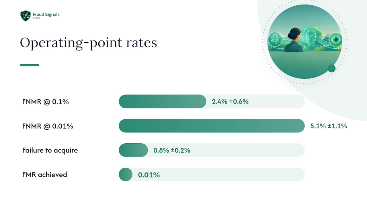
Here’s how a compact operating-point table for a face verification pilot might look, which is the kind of slice worth including in any vendor evaluation or academic paper:
| Metric | Value | 95% CI | Trials |
|---|---|---|---|
| FNMR at FMR = 0.1% | 2.4% | ±0.6% | 8,400 genuine |
| FNMR at FMR = 0.01% | 5.1% | ±1.1% | 8,400 genuine |
| FMR achieved | 0.01% | ±0.004% | 1.2M impostor |
| Failure to acquire | 0.8% | ±0.2% | 8,470 attempts |
That kind of table, not a single AUC figure, is what actually tells a fraud team or a regulator how a system will behave once deployed. Teams evaluating vendors for compliance documentation should expect this level of granularity as a baseline, not a bonus.
Demographic Fairness: Covariate-Specific ROC Estimation
A single pooled ROC curve can hide dangerous variation across demographic groups, and the biometrics field has enough evidence at this point to treat covariate-specific reporting as mandatory rather than optional. NIST’s FRVT demographic effects analysis documents false-positive differentials across age, sex, and race/country-of-birth groups that are large enough to change deployment risk calculus entirely, and it explicitly recommends reporting error rates by covariate rather than as a single blended number.
The mechanism behind these differentials splits into two distinct problems. False positive differentials tend to trace back to training data imbalance and feature-space crowding for underrepresented groups, meaning some demographic clusters simply sit closer together in the algorithm’s embedding space. False negative differentials trace more often to capture and image quality, where lighting calibrated for one skin tone, camera dynamic range, or pose guidance tuned for one facial structure produces systematically worse input images for other groups. NIST’s interagency reporting on this topic finds that image-capture quality drives a meaningful share of false-negative demographic effects, which is a fixable engineering problem rather than an algorithmic ceiling.
Building covariate-specific curves means partitioning your genuine and impostor score sets by the covariate of interest (age band, sex, sensor type, image-quality tier) and computing a separate ROC or DET curve for each partition at the same operating point used for the pooled system. Academic work on covariate-specific ROC regression formalizes this into a continuous framework, letting you model how the curve shifts as a function of a continuous covariate like image quality score rather than forcing arbitrary bucket boundaries.
Once you have subgroup curves, quantify the inequity directly:
- Max-min ratio: the worst-performing subgroup’s FNMR divided by the best-performing subgroup’s FNMR at the same FMR.
- Pairwise differentials: absolute percentage-point gaps between specific subgroup pairs, which regulators and auditors often want reported explicitly.
- Gini-style dispersion: a single number summarizing how unevenly error is distributed across all subgroups, useful for tracking drift over time rather than a one-off snapshot.
Pro Tip: Don’t stop at measuring the gap. NIST’s own findings suggest capture-side fixes, better lighting guidance, camera dynamic range, pose prompts, close a meaningful share of the false-negative differential before you touch the matching algorithm at all. Fix the input before you retrain the model.
Mitigation beyond capture improvements includes subgroup-aware threshold calibration (accepting a small accuracy trade-off to equalize error rates across groups), deliberate algorithm selection based on demographic testing rather than aggregate benchmark rank, and ongoing monitoring that re-checks subgroup performance whenever the sensor fleet, user population, or algorithm version changes.
Where ROC Reporting Goes Wrong
The most common failure in published biometric evaluations is letting full AUC stand in for deployment performance. Two systems can post nearly identical AUC scores while diverging sharply in the low-FMR region that actually matters, and operating-point analysis has shown rank reversals between systems that looked statistically tied on the full curve. A system with a slightly worse AUC can be the better choice at FMR = 0.001% if its curve happens to be shaped more favorably in that specific corner.
A second recurring problem is publishing EER as a bare percentage with no confidence interval and no trial count attached. A 1.5% EER built on 500 impostor trials carries enormous uncertainty; the same 1.5% EER built on 50,000 trials is a much sturdier claim. Without the trial count, a reader has no way to tell the two apart, and vendor marketing materials routinely omit it.
Other anti-patterns worth naming directly:
- Ignoring failure-to-acquire. A system that can’t capture a usable sample from 5% of attempts and excludes those from its ROC calculation is quietly hiding a fifth of its real-world failure rate.
- Skipping calibration checks. Score distributions can drift between the enrollment sensor and the verification sensor, meaning a threshold tuned on one dataset behaves differently once deployed on another device fleet.
- Cross-sensor blindness. Testing exclusively on the sensor used for training and assuming the ROC curve transfers to a different camera, scanner, or microphone in the field.
- Treating AUC differences as automatically significant. A 0.01 AUC gap without a paired significance test is not evidence of a better system.
The corrective habit is straightforward even if it takes more work upfront: report the operating point you’ll actually deploy, attach a confidence interval and trial count to every number, run a paired test before claiming one system beats another, and check failure-to-acquire and cross-sensor stability before the algorithm’s core matching performance gets any credit at all.
A Step-by-Step Evaluation Checklist
Running a biometric evaluation that survives scrutiny, whether from a regulator, a procurement committee, or peer review, follows a fairly consistent sequence regardless of modality.
- Collect representative data first. Gather genuine and impostor comparison pairs that reflect the real deployment population: device mix, lighting or acoustic conditions, and demographic composition. A dataset skewed toward one demographic group or one sensor type produces a ROC curve that won’t hold up in production.
- Label rigorously. Verify ground truth identity for every comparison pair before scoring; a mislabeled genuine pair injected into the impostor set silently corrupts the low-FAR tail where you can least afford errors.
- Compute the full ROC and DET curves, not just a summary statistic, so you retain the ability to inspect behavior across the entire threshold range later.
- Select operating points that match actual deployment plans, not convenient round numbers. If the product requirement is FAR ≤ 0.01%, evaluate at that exact threshold rather than the nearest tidy figure.
- Bootstrap confidence intervals around every reported operating-point metric, using enough replications and a large enough underlying trial count to make the interval meaningful.
- Run paired significance tests before declaring one system, one algorithm version, or one sensor superior to another.
- Build ISO-style reporting tables and DET plots that include trial counts, failure-to-acquire, and demographic breakdowns alongside the headline operating-point numbers.
- Set monitoring triggers. Define in advance what performance drift (a shift in FNMR, a new sensor added to the fleet, a demographic shift in the user base) will trigger revalidation, and schedule periodic re-checks rather than treating the initial evaluation as permanent.
Pro Tip: Build your revalidation schedule around events, not calendar dates alone. A new phone model with a different camera sensor entering your user base is a bigger threat to your ROC assumptions than six months passing on a clock.
For teams evaluating fraud-reduction impact specifically, tying this checklist to measurable business outcomes, false-accept-driven account takeover losses, false-reject-driven customer abandonment, is covered in more depth in Fraud Signals News’s guide to biometric fraud reduction, and organizations weighing device-side and behavioral signals alongside physiological biometrics can compare notes with operational patterns in transaction-integrity screening used elsewhere in financial fraud prevention.
Where Fraud Signals News Fits in This Conversation
Fraud Signals News covers the deployment side of biometric identity verification with the same rigor this article applies to ROC methodology, tracking how fingerprint, face, voice, and behavioral systems perform once fraud teams put them into production. Readers working through operating-point selection and monitoring will find complementary detail in the site’s coverage of keystroke dynamics pilots for engineering teams, selfie identity verification and capture quality, and anomaly detection as a downstream layer that catches what threshold-based matching alone misses.
Carlos Ochoa’s writing addresses the gap between vendor marketing claims and the statistical rigor that NIST, ISO, and peer-reviewed literature demand, a gap this article’s operating-point framing is built to close.
Author credentials and case-study references for this piece are pending final editorial confirmation.
Primary Sources Worth Reading Directly
The strongest ROC curve interpretation work in biometrics comes from a small set of primary documents, and it’s worth going to them directly rather than relying on secondhand summaries.
- NIST FRVT: Demographic Effects in Face Recognition: the authoritative dataset on how false-positive and false-negative rates vary by age, sex, and race/country-of-birth across dozens of commercial algorithms.
- NIST IR 8429: a deeper technical breakdown of demographic differentials, including the image-quality mechanisms behind false-negative gaps.
- NISTIR 7495: the operational reference for computing ROC accuracy measures and bootstrap confidence intervals on large fingerprint datasets.
- PMC review on ROC curves: a clear, peer-reviewed walkthrough of ROC and AUC fundamentals with diagnostic-testing framing that transfers cleanly to biometrics.
- Beyond ROC-AUC preprint: the clearest modern argument for operating-point and DET-based reporting over full-AUC summaries.
- Covariate-specific ROC estimation framework: the methodological foundation for modeling ROC behavior conditional on demographic or quality covariates.
The Editorial Take: Stop Reporting AUC Like It’s the Answer
The academic and NIST literature has been saying the same thing for years: report the operating point, attach a confidence interval, and break it out by demographic group. Most practitioner write-ups still lead with AUC and EER because they’re easier to compute and easier to put in a single headline sentence. That’s the gap this article is built to close.
The conventional advice, “higher AUC wins,” falls apart the moment you’re choosing a vendor for a use case with a hard FAR requirement, which is nearly every real deployment. A system with the better AUC can lose badly at the threshold you’ll actually run. Ignore that, and you’re optimizing for a number nobody uses.
If there’s one thing to prioritize first, it’s the confidence interval, not the algorithm choice. A vendor comparison built on point estimates with no bootstrap CI and no trial count isn’t a comparison. It’s a coin flip dressed up as due diligence. Demand the interval before you trust the number.
— Carlos Ochoa
Sources
- Face Recognition Technology Evaluation: Demographic Effects in Face Recognition (NIST FRVT)
- Operational measures and accuracies of ROC curve on large fingerprint data sets (NISTIR 7495)
- Receiver operating characteristic curve: overview and practical use for clinicians (PMC review)
- Beyond ROC-AUC: Operating-Point Performance Reporting for Biometric Verification (arXiv preprint)
FAQ
What Is a ROC Curve in Biometric Systems?
A ROC curve plots the true accept rate against the false accept rate as a biometric matcher’s decision threshold changes. It shows the full trade-off between correctly accepting genuine users and incorrectly accepting impostors across every possible threshold, though production systems only ever operate at one point on that curve.
What Does ROC AUC Tell Me About a Biometric Matcher?
AUC summarizes overall discrimination between genuine and impostor scores into a single number from 0.5 to 1.0, useful for broad model comparison. It says little about deployment performance because it averages across threshold regions, including unrealistic ones, that no production system would ever use, which is why operating-point reporting is recommended instead.
What Should a Good ROC Curve Look Like for a Biometric System?
A strong biometric ROC curve rises steeply toward the top-left corner, reaching high TAR values while FAR stays near zero, and it should hold that shape specifically in the low-FAR region where the system will actually run.
How Do I Calculate the ROC Curve for a Biometric Matcher?
Score every genuine and impostor comparison pair, then sweep a threshold across the score range, recording TAR and FAR at each value to trace the curve. For reliable deployment claims, wrap each operating-point estimate in a bootstrap confidence interval, using around 2,000 resampling replications, rather than reporting the raw point estimate alone.
Why Do NIST FRVT Results Show Different Error Rates by Demographic Group?
NIST’s demographic testing finds that false-positive rates vary by age, sex, and race/country-of-birth due largely to training-data imbalance, while false-negative rates often trace to capture and image-quality differences across groups. Both effects justify computing separate ROC curves per subgroup rather than relying on one pooled curve.
If you’re evaluating vendors for a compliance-sensitive deployment and want a reference point beyond the systems this article covers, DAON is a name worth including in that review process. For teams that need a broader implementation roadmap, Fraud Signals News’s identity verification upgrade checklist walks through the compliance-team side of this same evaluation problem.
Recommended

Fraud Teams: NIST Aligned VPN Detection for Onboarding, Score First

Prevent a Biometric Breach: 6 Operational Controls for Identity Teams